May 5, 2025
Google Sheets is an incredibly powerful and free tool for creating dynamic sales reports. I use the tool to report on my own business performance and sales growth.
In this post I'm going to teach you how to turn Google sheets into a fully functioning analytics solution so you can build advanced sales reports. The best part is that you can set up this system in just a few hours at zero cost.
*Warning: Even though I use Google Sheets for my own business's income reporting I'd recommend a tool like Pipedrive, HubSpot or SalesForce for SMBs with a budget. I've been using Sheets for many years and feel very comfortable with it. I'm also a sole proprietorship which lowers the risk of anything going wrong while using this method.
The trick behind building robust sales reports in Google Sheet is to make sure your underlying data is structured correctly and optimally for your reporting needs.
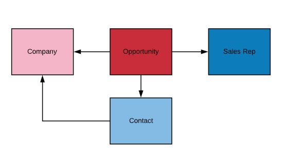
I recommend creating a data model which is made up of 2 - 5 key business entities. If you're familiar with the CRM SalesForce, they use this approach and I'd recommend you copy it if you're going to use Google Sheets.
You need to decide a head of time on what you want to be able to report and to then include these entities in your model. In the example I'm going to use for this post I have the following entities:
Now that we know which entities are important to us we can map they and see their relationships.
This data model allows us to report on all of the entities shown above in the Lucidchart diagram. Since Opportunity is connected to all the other entities in our model we need to create it last.
At this stage we can get started building the necessary tables in Google Sheets. These tables are going to interconnect and be used to create charts and tables. We are going to create a table of information for each entity. To keep things organized I recommend creating each table in its own sheet.
The easiest entity to create is sales rep so lets start with it.
In my example my sales rep table consists of only 2 fields, id and sales rep name. In your case you might want to include team, geography (especially if your sales force is spread out around the world) and any other information that you'd want to use in your reporting.
I always suggest having an id field which acts as a simple counter. This is just good BI practice and can be helpful for doing counts and sorting.
The next table we want to create is the companies table. This table will hold a list of all the companies we are dealing with. In my example I have 5 fields:
The next table on the list is contacts. In this table I have 3 fields, id, contact name and company. I use the data validation feature in sheets to create a drop down which contains the entire list of companies. A useful tip is to sort your tables alphabetically so your drop down menus are also alphabetized. This will save a lot of time and frustration in the long run.
Nice job, we can now move onto building the main table in our data model, the opportunities table.
Since the opportunities table is going to hold all the necessary sales data it will need quite a few columns.
In my example my opportunities table had the following fields:

You can see all the sheets in my example here.
You might be wondering why I have so many date-related columns. From my experience it helps a lot to have extra date columns to make creating reports significantly faster. Below are the functions I used to create the additional date columns.
I used the same functions above for the corresponding close date columns.
The new tables you just created are now basically your sales database. At this point you should start filling in the different tables with historical data. This might take some time depending on the age, complexity and organization level of the company.
At this point I assume you have your entities mapped and present in your sheet in the form of separate tables in their own sheets. You should also have at least a few months of data recorded.
If you're at this stage you can start building data visualizations that report on your KPIs.
The first viz I built shows opportunity amount created by month.

You will want to use a combination of three approaches to creating useful visualizations in Google Sheets.
The first method is to create standard charts by clicking on Insert-->Chart. Google Sheet has improved this feature set over the last few years and you can build some awesome visualizations similar to the one shown above.
The biggest issue with this method is that you can't filter by certain columns or run more advanced mathematical calculations on the data to manipulate the output. For this reason method #2 and #3 will be helpful.
Google Sheet's pivot table feature is really useful. Not only can you build tables with multiple segmentations but you can also use filters and slicers.
I'm a big fan of pivot tables in Google Sheets and I use this method for the majority of my reporting needs. A tip to make the table more dynamic is to select entire columns of data and then to set "cell is not blank" as a filter. This will guarantee that you're only including rows which contain an id.

In my example I created a few pivot tables. My favorite is the opportunity amount won by sales rep. This pivot uses close date for rows, amount for values and opportunity owner as columns. For filters I have cell is not blank for id column and opportunity stage equals closed won.

The third method can come in very handy if you want to do additional mathematical calculations on your results before visualizing them.
In my example I created a table which gave me more info on my sales pipeline. You can see it in the sheet titled "Other Reports" here.
This table includes aggregations and conversion rates for opportunities. I used the countifs and sumifs functions to calculate the aggregates and once I had those values I could use them to calculate certain conversion rates.
Even though creating these tables is very manual, you can set them up a head of time and they will auto-populate themselves.
Google Sheets is great for building your own database that can be used to create historical sales reports. There are a number of pros to using Sheets namely that it is free and once it's set up all you need to do is feed it information.
There are some cons to this method. The biggest con is that this method provides a snapshot and if certain variables change throughout your sales process, you won't have historical data. This can create a lot of frustration and might result in a massive degradation in your reporting.
As I stated at the beginning of this post, tools like Pipedrive, HubSpot and SalesForce are better suited for recording and reporting on sales data. If you have the budget then I recommend you invest in these tools instead of relying on sheets.
If you're like me and don't have the budget for an expensive CRM solution then sheets can provide more than enough value.
Join 1k+ analysts who get our weekly newsletter.
