May 5, 2025

Most businesses and independent bloggers still rely on Google Analytics for their content analytics. Google Analytics is an amazing product, especially considering that the standard version is available for free.
I get a lot of value from Google Analytics but I wanted to challenge myself to try and get more. I specifically wanted to try and analyze my content by post, something that isn't easy in GA.
Another goal of mine was to go from Google Analytics' standard reporting to a single, more inclusive visualization. To see how each individual piece of content was impacting traffic growth.
Well my friend, I managed to achieve my goal and built a content analytics dashboard which does exactly as planned. You can see the end product in the screenshot below, or by visiting the dashboard on Tableau Public.

In this post I'm going to share with you how I managed to build this content analytics dashboard and how you can use it to identify key insights about your content's performance, how your SEO efforts are impacting growth, and more.
My strategy for this project was to try and move my Google Analytics data into a database which I could then plug into Tableau (check out my introduction to Tableau post).
Once I had the "raw" data in the database I could leverage Tableau's powerful formulas, parameter, filters and visualization options to build a useful dashboard.
Before we dive in I want to mention that it is important for you to understand the concepts covered in this post. You could use the same approach covered in this post to analyze your eCommerce business, SaaS business, or online advertising spend.
The first step is to connect your Google Analytics account to your BigQuery account via Stitch. I'm in no way affiliated with Stitch, I just like them as a service.
I've been experimenting with Stitch for a while and even use them with one of my clients to move Shopify and Facebook ads data into their data warehouse.
Stitch is an ETL tool which automatically moves data from dozens of different sources into your database of choice. The best part about Stitch is they have a very generous free plan. This makes Stitch ideal if you don't have too much data to move around.
Once you've signed up with Stitch you'll want to add BigQuery as a destination. You can read how to add BigQuery as a destination here.

The next step is to add Google Analytics as a source. This part can be tricky because you can't simply connect it and get access to everything. Google limits the number of dimensions and measures you can pull via their API.
Below is a screenshot of the fields I pulled in but in hindsight I would of changed this list to the list shown under the screenshot.

The fields I would have pulled in instead include:
Dimensions
Measures
You can see a full list of the available dimensions and measures here.
Why this specific list? There is a crazy limitation in the Google Analytics API when it comes to unique users and pageviews. If you pull the data on a daily bases you will get daily unique users and daily unique pageviews. This limits you when you need to aggregate on a weekly, monthly or quarterly bases.
You'd typically have a user or visitor id to work with but Google doesn't provide that level of granularity so you're stuck. After a lot of unnecessary work I ended up focusing only on sessions which is good enough for my needs at this stage.
While adding Google Analytics as an source in Stitch you'll be asked to select a starting time and replication frequency. Go with what makes the most sense for you. I chose the start date of the blog and set the replication frequency to 6 hours.
After everything is set up correctly Stitch will start loading the data. Stitch will load your data retroactively but note that they only do this once. This initial load is free.
You'll be able to know once data is moving from your Stitch dashboard.

If everything worked as expected you should now see aggregated Google Analytics data in your BigQuery account. Spend a bit of time exploring the data.

Unfortunately I had a ton of duplicates in y table which I removed by creating a custom view and grouping the values I cared about. I also removed all rows where the session count was zero.
The query I used to create my view can be found below.
SELECT
usertype,
medium,
_rjm_record_hash,
landingpagepath,
campaign,
source,
date,
max(sessions) as sessions,
max(bounces) as bounces,
max(users) as users,
max(pageviews) as Pageviews
FROM
`projectbi-211107.projectbi__google_analytics.report`
WHERE
(sessions) > 0
GROUP BY
1,2,3,4,5,6,7
If you've never used Tableau before then I recommend checking out the video below or this detailed Tableau guide that I published on this blog. These will get you on your way to learning one of the most powerful data visualization solutions on the market today.
You'll also want to download Tableau Desktop. You can take advantage of Tableau's 14 day free trial.
Even before creating my view in BigQuery I connected the Google Analytics table in BigQuery to Tableau. This way I could easily investigate the data and build the query for my view quicker.
The first major step that I took in Tableau was to build out a moving window function. A moving window is a special type of formula which groups values based on an operator and a time frame.
My goal was to create an area graph which represented the moving sum of sessions over time.
Let's look at an example to help explain this type of calculation.

In the screenshot above you have 2 columns. The blue column is a regular count of X. In the green column you have the moving sum of X in a window of 7 days.

If you open your calculator and sum up the numbers in the blue column it will equal the number in the green cell.

If we move back one cell we see that the window shifts over time. We can now use the green column to see the trend of the 7 day window for X.
Why is this type of grouping so powerful? The short answer is that it eliminates variance by taking a group of values and compares that group to subsequent groups. In web analytics you have common occurrences of one off spikes which can skew your reporting to send a misleading message. Moving window graphs eliminate that issue.
The window range should always be a multiple of 7. This way each point will have an equal number of weekends.
The formula I used to create my moving window is:
iif(FIRST() >= [Window Range] or LAST() >= [# of days],NULL,WINDOW_SUM(sum([Sessions]),-[Window Range]+1,0))
The green items are parameters which allow me to change the window size and control how many days are shown in the visualization.
There are many different dimensions which you'd want to look at when segmenting your traffic. To make it easy to switch between these dimensions you'll want to create a segmentation parameter.
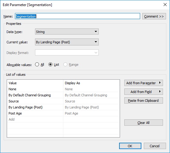
My parameter included the following values:
Once you've created the parameter you'll need to create a calculated field which switches out the segmentation option based on the value in the parameter. Below is a screenshot of my calculated formula.

Since my main goal was to try and understand my traffic growth in terms of blog content, I needed to find a way to segment my traffic by blog post.
My solution was to take the ga:landingpagepath field and do a bit of manipulation to get the actual landing page path. The field is deceptive because it actually holds the landing page path and subsequent parameters and not simply the page path. This results in dozens or more variants of the same page which doesn't help us if we want to group by page.
The way I got around this was by using the formula below.
iif(CONTAINS([Landingpagepath],"?") = false, [Landingpagepath], LEFT( [Landingpagepath],FIND([Landingpagepath], '?')-1 )).
This formula checks if the field value has any parameters and if it does it takes everything before the starting "?" value.
Now that I could isolate the page path I went and created a custom Google sheet in Google Docs. This spreadsheet would act as my "posts table".

Yes, I created this spreadsheet manually but you could definitely set up a zap in Zapier or use a recipe in IFTTT to build out something more automated. You could also add it to BigQuery and do the join right in BigQuery. I covered this process in my previous post on how to track your life like an analyst. It took me about 10 minutes to build this spreadsheet. You can get a full list of your blog posts from your blog's sitemap.
The fields I added to my spreadsheet include:
Once the spreadsheet is built go a head and join it to your data set in Tableau. I used a standard left join and the formula I mentioned earlier to isolate the page path..

At this stage you have all the building blocks you need to build out your dashboard.
Some extras which I built out but are optional include:
iif(source = "(direct)" or ISNULL([source]) = true, "Direct", iif([Campaign] != "(not set)", "Campaign",
iif(source = "google" or source = "bing" or source = "yahoo" or source="yandex.ru" or source="duckduckgo.com", "Organic",
iif([Medium] = "email", "Email",iif(source = "t.co" or source="quora.com" or source="reddit.com" or source="old.reddit.com" or source="m.facebook.com"
or source="lnkd.in" or source="lm.facebook.com" or source="linkedin.com" or source="twitter" or source="l.facebook.com","Social",
"Referrer")))))
Now that you've got your dashboard built the fun part can start. I was able to identify a number of useful insights from my dashboard which I've shared below.
It's important to reminder that all these views are moving windows of 28 days. That means that each point on the graph is the sum of sessions in the previous 28 days.
The first insight I noticed was the steady organic traffic growth I've seen from my two Excel-related posts. I had noticed in my Ahref's account that I was climbing up the rankings for "cohort + excel" keywords and this now helps validate this change.

The next insight that stood out like a sore thumb was the big boost in direct, organic and social traffic in the last few weeks.
Since my dashboard is super dynamic I'm able to easily isolate the "Direct" traffic and break it down by post.

We can now easily see that the recent spike can be attributed to my recent post on how to track your life like a business analyst. We also see that my post, The complete guide to measuring product usage for startups, is driving a lot of direct traffic even a few weeks after publication.
Social media marketing is tough in my niche but I've had some good success recently on Reddit and Twitter.
The graph below shows my social traffic grouped by traffic source. I've highlighted the most prominent sources.

The last insight I'd like to share with you is a breakdown of my traffic from older posts grouped by post. You can clearly see from posts I published more than 6 months ago only 2 of them are driving significant organic traffic in a 28 day window. 2 or 3 others are making smaller contributions but the majority of the traffic from this cohort is from only 2 posts.
I spent very little effort on SEO when I first started this blog and this graph helps to show that.

When comparing the screenshot above to the one below you can see a much better distribution among my newer posts, especially in terms of growth over time. The how to track your life post is an outlier.

I hope these 4 examples helped to demonstrate the power of this dashboard. Once you have the foundation in place you can get very creative and build a dashboard that can answer a very wide range of questions related to the growth of your blog.
Google Analytics is a powerful tool for the aspiring blogger. The ease of use and out of the box reporting is great but I hope this post has shown you how to get even more value from your traffic data and build a powerful content analytics dashboard with minimum effort. If you're serious about SEO and content analytics then this approach is much more beneficial to you than using the standard GA reporting.
Thanks for reading.
Join 1k+ analysts who get our weekly newsletter.
